Rebuilding the Brand's Visual Language
A full visual identity rebrand, typography, color, photography direction, and the systems to keep it consistent as a team scaled around it.
Role/Dates
Creative Content Director, Tipsy Elves | 2023–2026
Skills
Typography & Type Pairing
Color Theory & Palette Development
Brand Identity Systems
Photography Direction
Logo & Usage Guidelines
Visual Hierarchy
Brand Guide Development & Documentation
Systems Design (Zero to One)
Team & Contractor Onboarding
Cross-Functional Rollout
[ the gap ]
The brand's visual identity had grown organically over years, functional, but inconsistent. No documented typography system, no defined color palette beyond 'what felt right,' no photography guidelines to keep a growing team of contractors and designers aligned. Every collection was basically reinventing the brand from scratch, moody for Halloween, technical for Snow, whatever felt right in the moment. Groundbreaking. Revolutionary. Florals, for spring.
[ what i built ]
logo rules
new colors
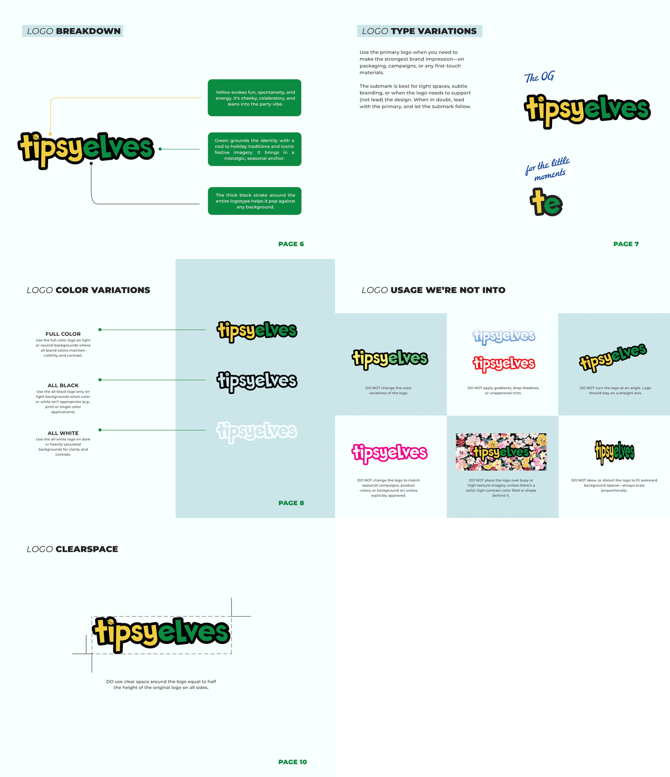
The logo itself didn't change, the rules around it did. Before this, the mark was getting stretched, tilted, recolored, even squeezed into a neon video overlay by well-meaning teammates. I set hard usage rules: no distortion, no rotation, black-and-white or true brand color only, clean backgrounds. Same logo, finally protected.
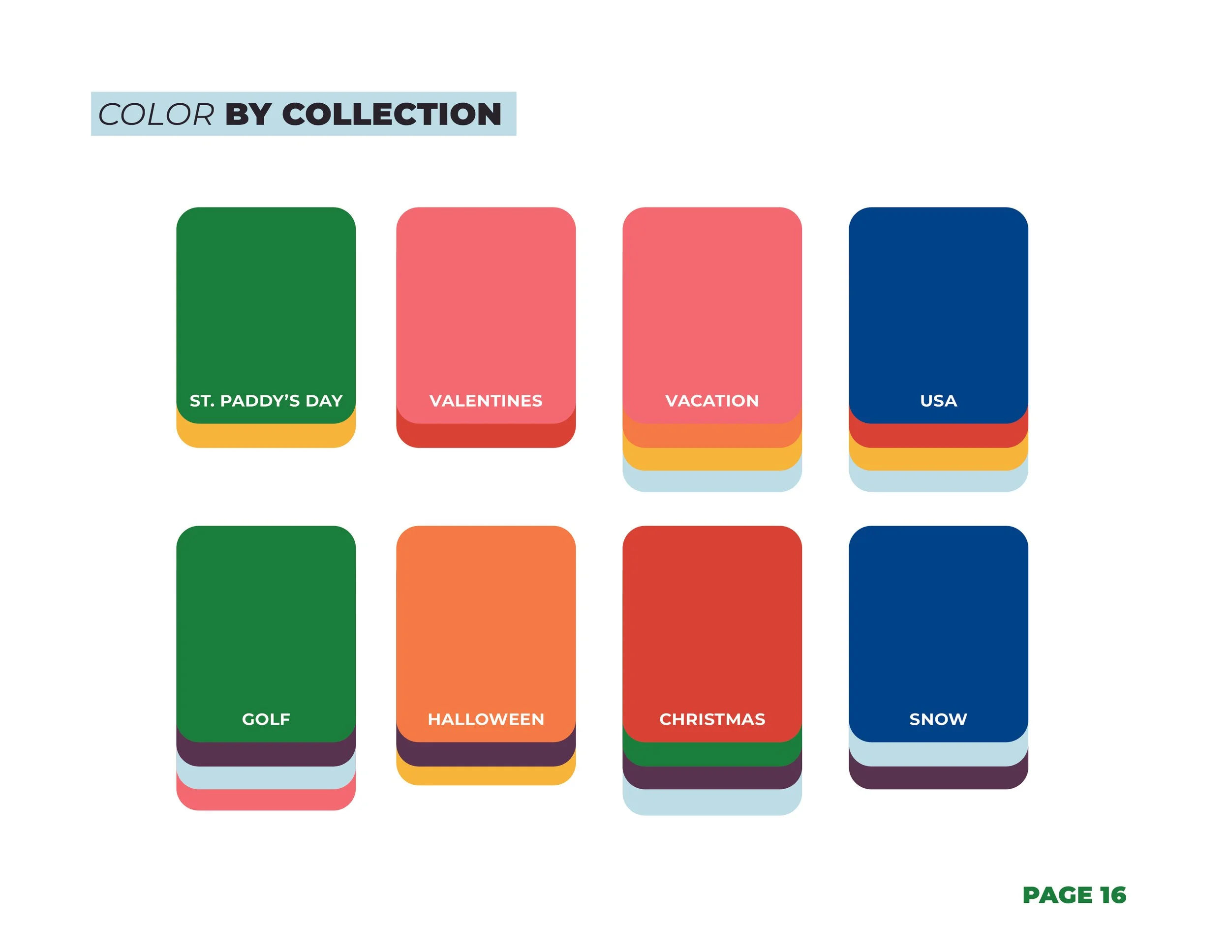
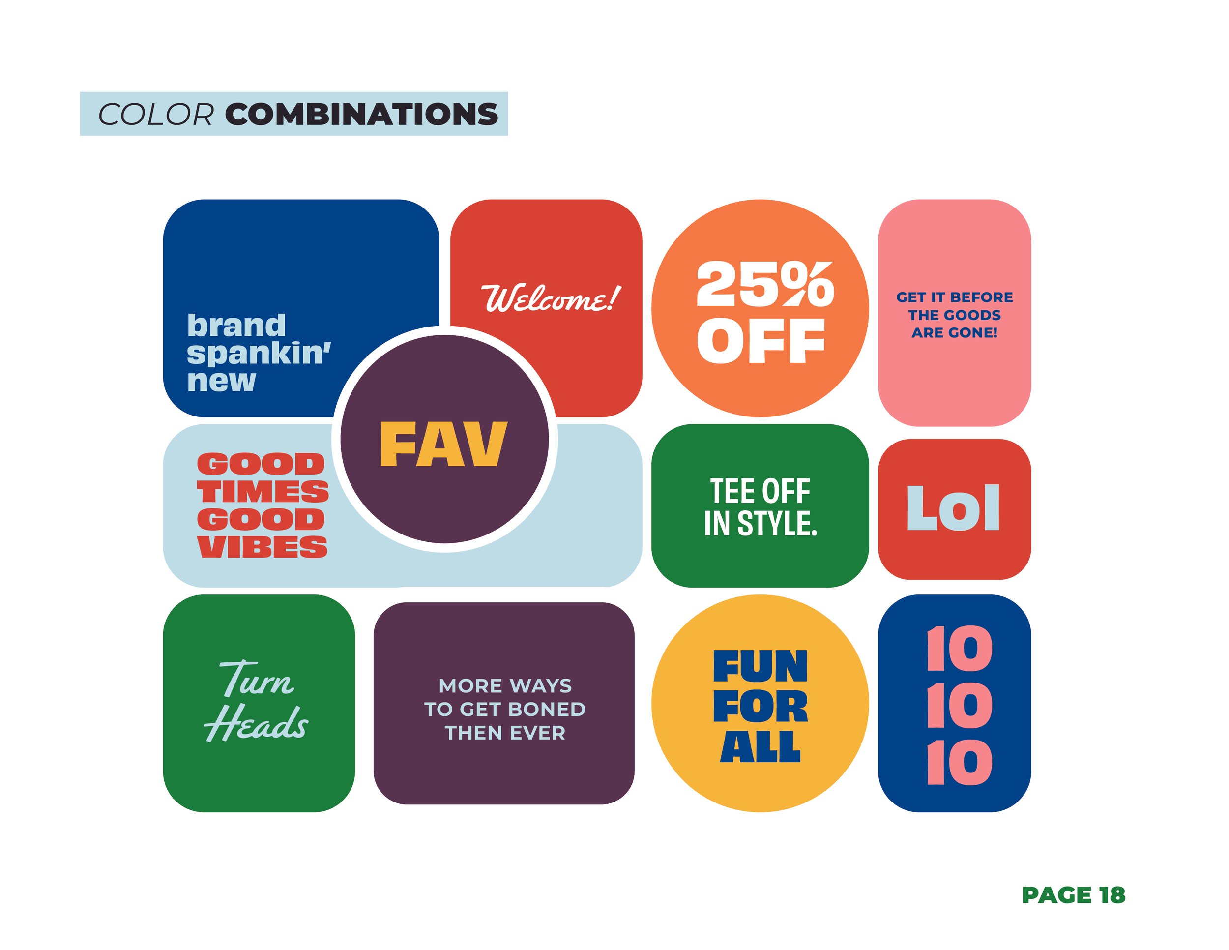
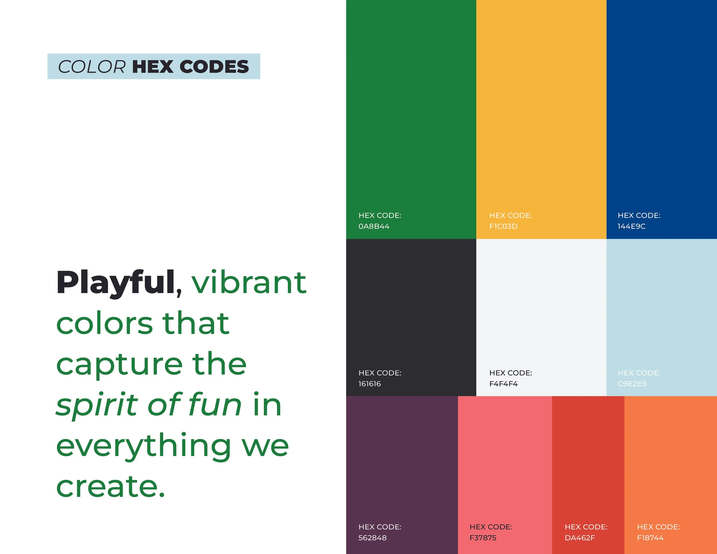
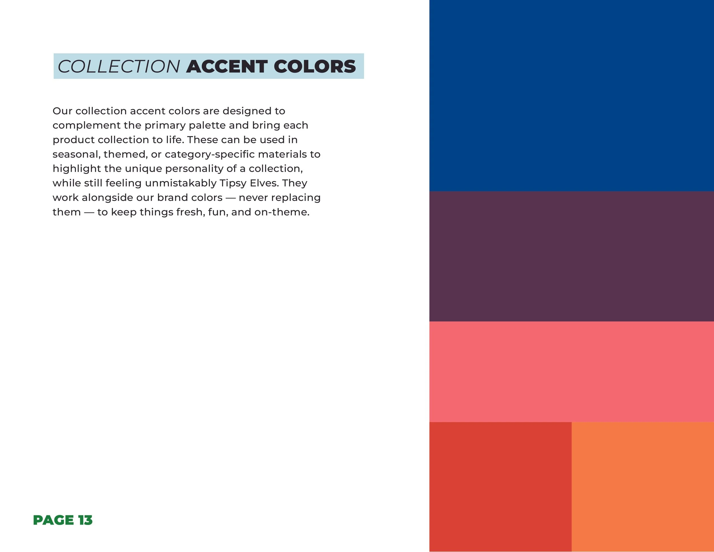
Green and yellow were already "brand," but nothing else was defined. I built out from there: paired green with a new neutral, light blue, since the team wanted green to lead over yellow, then let yellow settle in as an accent. From there, I mapped a color language per collection, Halloween pulled orange and purple, Snow pulled blue and purple, Christmas pulled red and green, each collection distinct, but every palette still speaking the same core brand language.
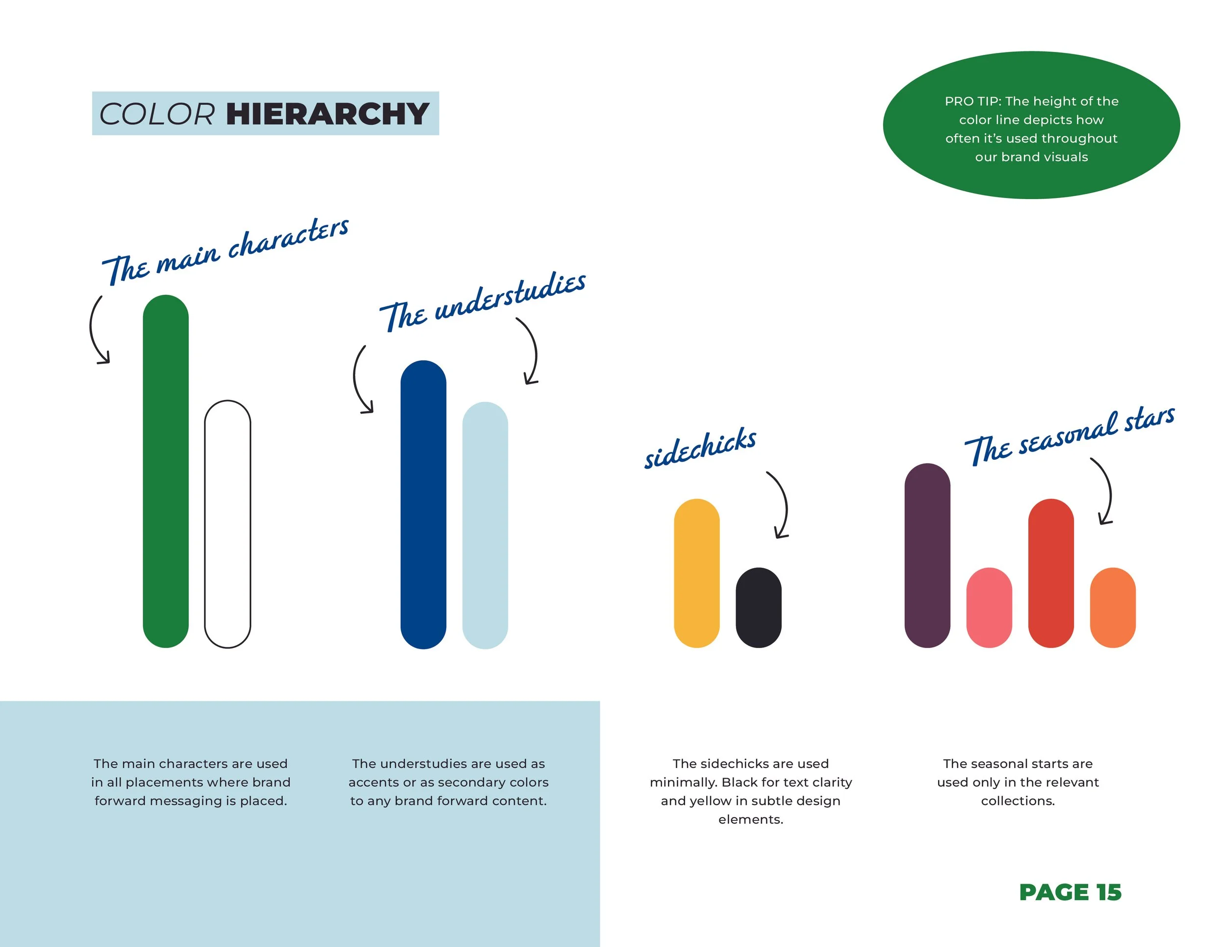
I even nicknamed the system for the team: main characters (used everywhere), understudies (secondary accents), sidechicks (used sparingly), and seasonal stars (collection-specific only). Made an abstract system instantly usable.
[ GIF break ]
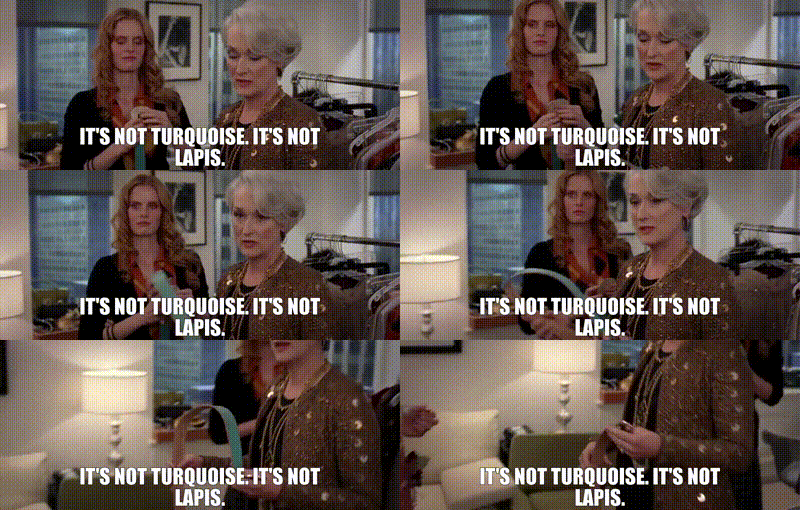
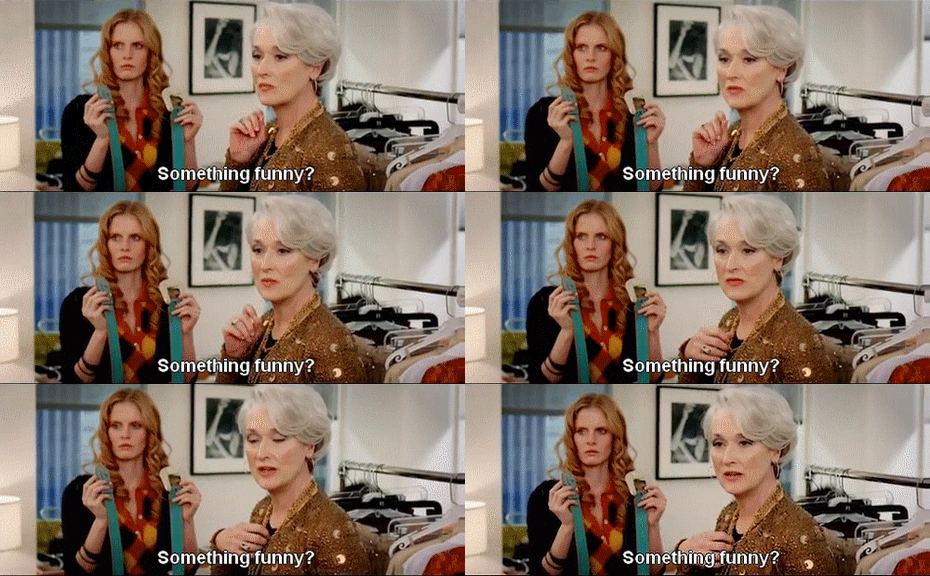
Actual snapshots of me discussing color selections to the rest of the team →
[ what i built - continued ]
typography
photography

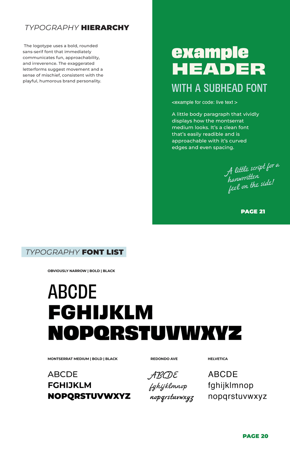
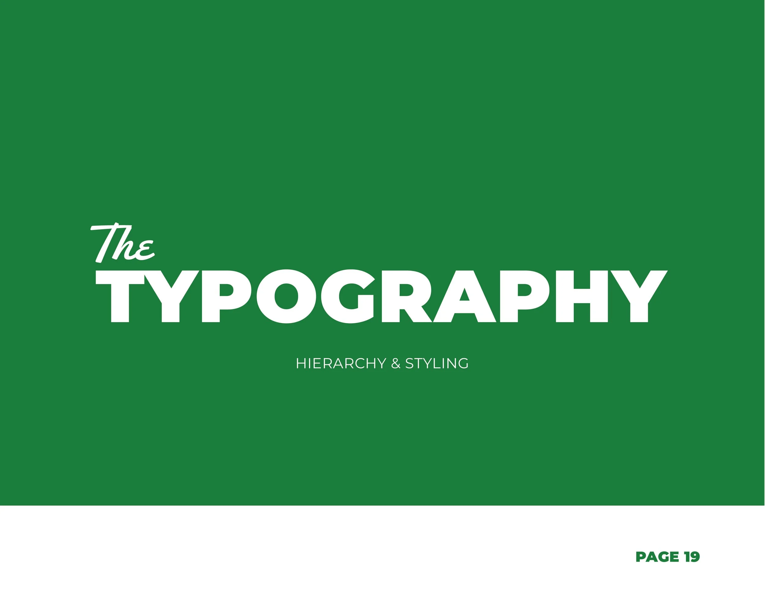
Before this, type was a free-for-all, a new typeface picked per collection, every launch. It caused approval bottlenecks and constant post-production rework during already-tight seasonal windows. I landed the brand on one flexible, thick sans serif with real range, legible, fun, irreverent when it needed to be, but clean enough to work for Snow and Golf too. Paired with a handwritten font for playful callouts, and Montserrat for long-form and web copy. One system, built for both personality and readability.
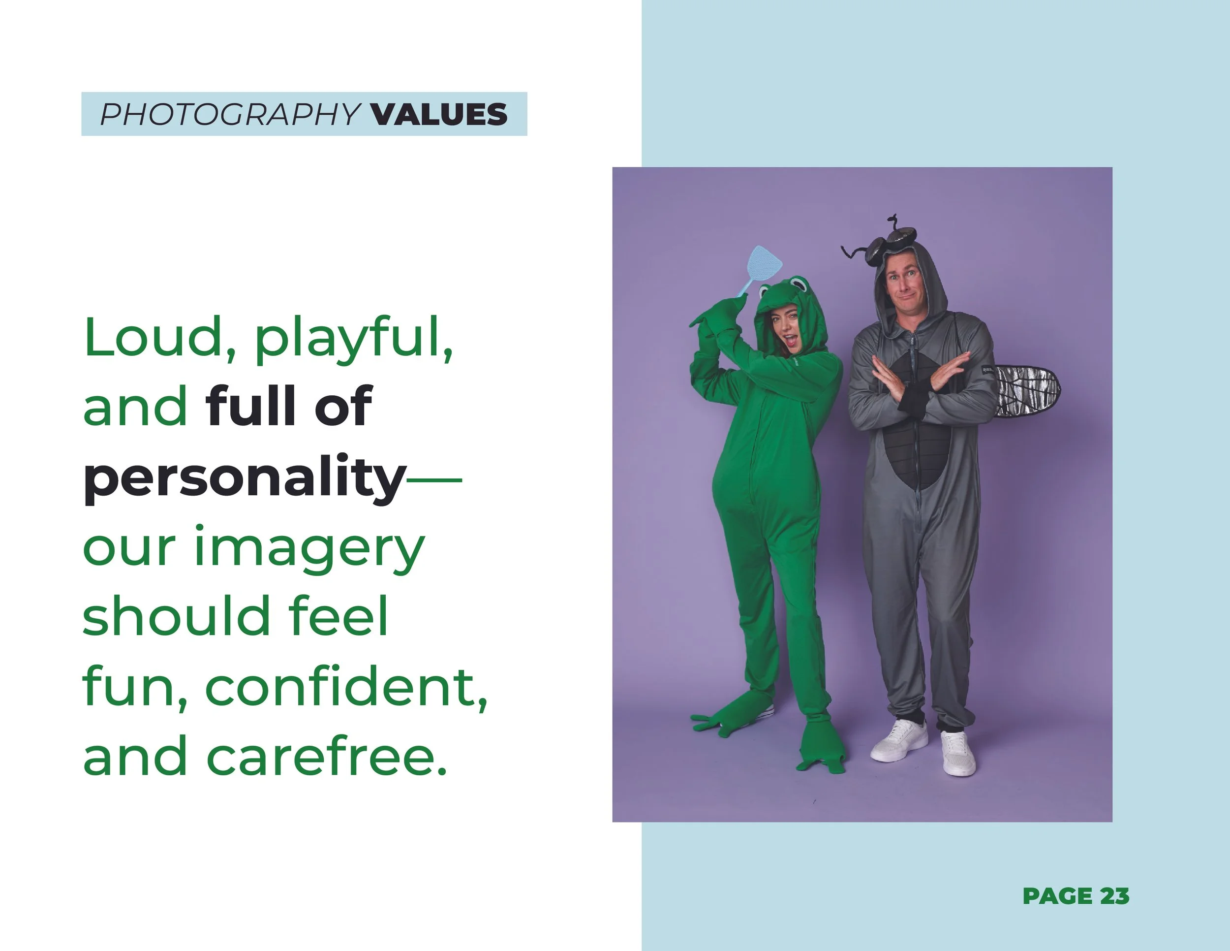
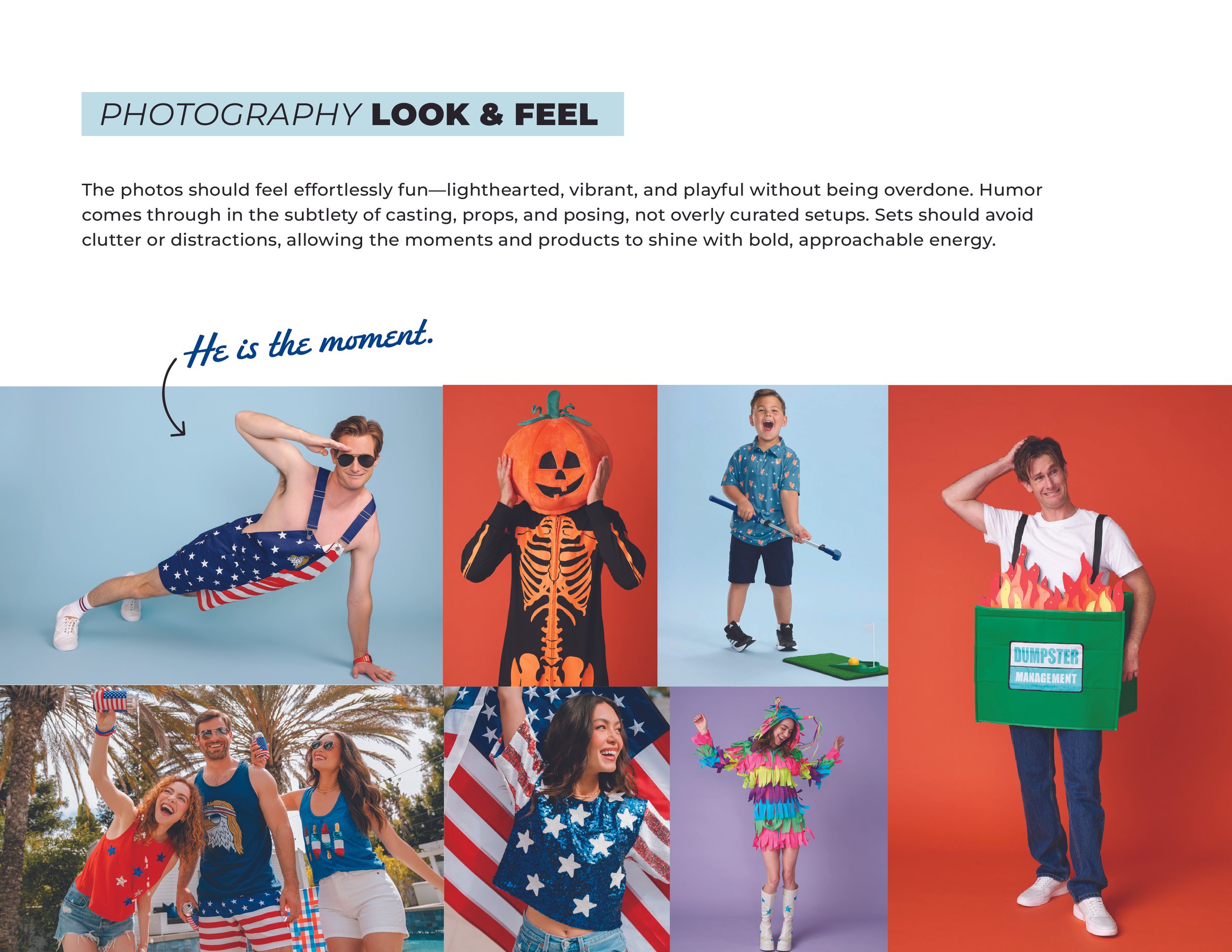
The real risk wasn't bad photography, it was drift. Halloween concepts leaned into dark, graveyard moodiness. Snow leaned high-performance and technical. Every collection wanted its own visual world, and the brand's actual throughline, fun, vibrant, irreverent, was getting lost in the split. I pulled direction from brands doing "modern nostalgia" well, MeUndies, Old Navy, Chubbies, and set a rule: keep saturation a little muted so photography supported the product instead of competing with it, and every collection had to feel like a dialect of the same language, not a different brand entirely.
[ meme break ]
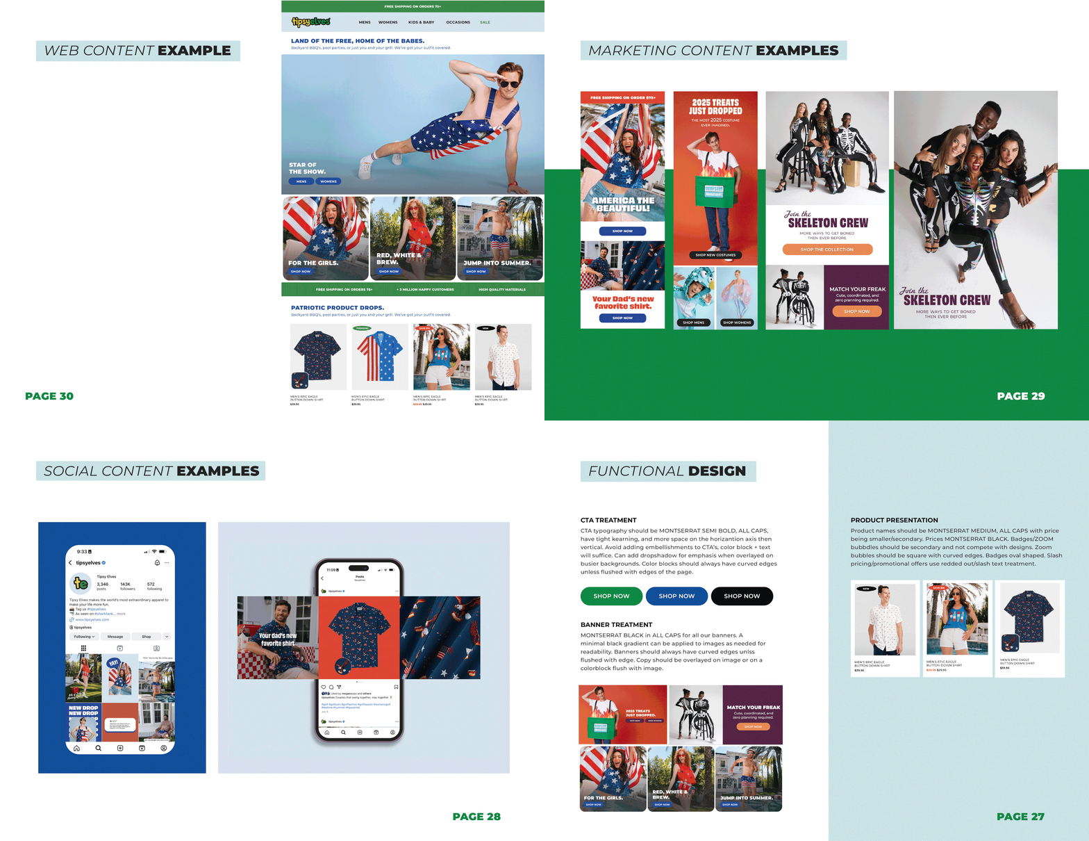
Pre vs. Post Visual Style Guide →
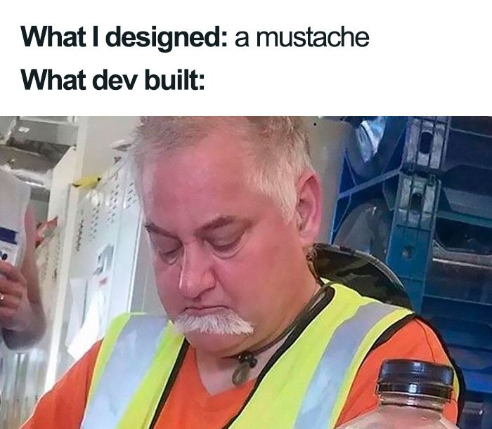
pre
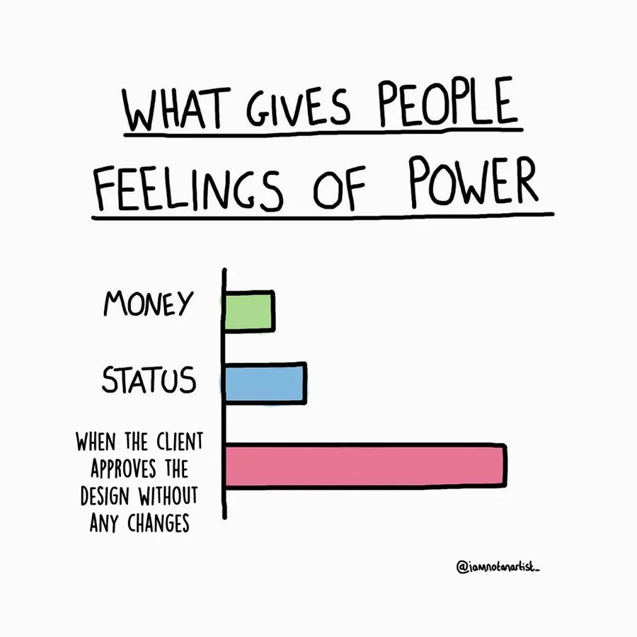
post
[ why it mattered ]
A brand guide isn't just a style reference, it's what lets a growing team move fast without losing consistency. Once this existed, new designers and contractors could get up to speed on "how Tipsy Elves looks" in one sitting instead of trial and error, and creative reviews got faster because everyone was already working from the same visual rules.